Quite apart from the circumstantial affiliations that normally obtain among contemporaries, and quite apart from the facile optical resemblances that one can discern among artworks across distances in time, looking at a painter’s canvases has a way of making demands of the viewer that amount to a responsibility, a set of obligations, a contract, neither of whose parties gain any reward without the other’s contribution. In the globalized bourgeois individualism of an administered planet, the monadic social context of present-day painting has had the uncanny effect of unfixing standardized visual signifiers from painterly convention, imbuing the problem of content with special urgency and conferring new liberties upon the artist and the viewer, even as it enjoins them both to beware of new oppression too.
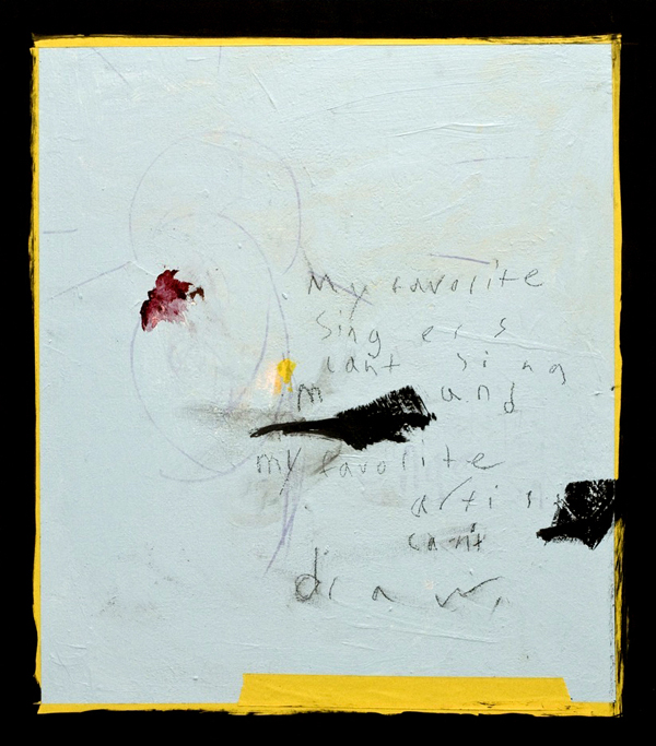
singers can’t sing
Arthur Rimbaud foresaw with characteristic prescience that in a mechanized industrial society like ours (which doesn’t only exist, as ultramodern doublespeak would have it, in “developed countries,” but which has now achieved worldwide status), our disinherited circumstance, easily deduced according to the symptoms of alienation – a global estrangement, not from each other nor from ourselves, but from a cultural heritage, a body of lapsed agrarian lore, which apparently used to bind people together by conserving an integrated set of commonplaces – will never dissipate, so long as we merely attempt to cure our sickness with a passively discontent nostalgia for some simpler time locked away in the distant past; but instead, more dynamically, our illness treats us, when we allow ourselves to be hurled into the crazy flows and breaks of urban life, this universal performative participation in the everyday world as a public sphere whose future remains undetermined: “I play myself,” the teenage French poet observed, and diagnosed our malaise.
A visual artist whose practice demonstrates the application of pigment as an allegory for self-determination is doing the viewer a rare service. Joseph O’Neal is such a painter, and the rest of the job gets done by his viewership, whose interpretation meets his creation halfway and completes it. O’Neal paints in the awareness of art’s condition. His work presents marks and signs together in a suspense that holds them free from prior associations and welcomes the viewer’s appraisal as if for the first time. O’Neal’s probity and forthrightness are in evidence in the following interview. In much the same way that his canvas entitled Walt Whitman complements – or, as he puts it, goes “rolling alongside” – the poet’s writing, these remarks are apposite to the pictures. These comments clearly show that this painter is his own subject – multitudinous, just like the rest of us, if only we could all recall.
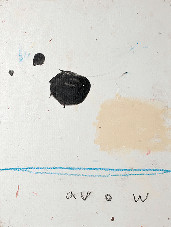
avow
Erik Noonan: It’s apparent that the reality your work addresses is emphatically an unseen one. Rather than make something visible, these pictures provide the intellect with sensuous access to an actuality that’s inaccessible to the senses, and what we perceive in each picture with our eyes is the procedure by which that contact has been established. In singers can’t sing, for example, we behold a formal use of pictorial space: a cadmium yellow border, and a sublayer of the same color under an unevenly applied pale blue, over which a conventional Madonna has been outlined in faint purple oil bar around a crimson smear on the left half. On the right half, we read: “My favorite singers can’t sing and my favorite artists can’t draw,” scrawled in smudged black oil bar between and around two large irregular black smears. And in avow, over an even coat of beach sand, two uneven blotches of black appear to the left of center, and a patch of cream has been lightly brushed onto the right side just below the midway line; under this, in a single back-and-forth motion, a thick line has been drawn in cerulean oil bar. Various reds, pinks and blues sparsely fleck the surface, and across the bottom quadrants the word “avow” is drawn in lowercase black scrawl. Both these pictures assert panting’s independence from rote visual knowledge, and meanwhile they establish an individual sensibility as the unmistakable source of imagery. Finally, at the same time, both singers can’t sing and avow claim beyond doubt that a painted image doesn’t hermetically seal itself off from all else; rather, it partakes of an exacting and supportive network of interdependent relationships with various discrete bodies of knowledge: in this case, the arts on one hand, and belief systems and institutional structures on the other. How would you describe your process – whether in general, or in a particular instance of making an image? How do the materials of the medium figure in that process?
Joseph O’Neal: In regards to my process I try and be as visceral and honest as possible in all aspects. I have to turn off the frontal lobe, the part of the brain that is the self, the consciousness so to speak. If there is a banging on the other side of the door I can try and replicate the banging through translation or I can open the door and let the banging speak for itself. My process is to open the door. Honest in that not second guessing my initial instincts, for instance; if I have the urge to paint over a part of a piece or a whole piece I have been working on (no matter how many hours I have put in to the piece) I must paint over it. This also goes for all mark making, colors, forms, etc. My two rules are not second-guessing instincts, and not to cheat a piece. My works lay on top of many layers and paintings that weren’t initially successful. This is ok this does not bother me. Sometimes parts of the unsuccessful paintings come through and work with the new material and paint to create something that is successful. Sometimes it’s completely buried.
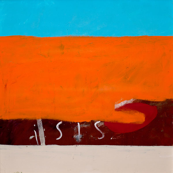
isis
EN: A recent neurological study has shed light upon brain function as it relates to moments of flash insight among artists engaged in a creative process, showing that in the moments immediately preceding these breakthroughs, the sensory apparatus demonstrates drastically reduced activity, effectively shutting out the external world – in direct contrast to a trend that is observable among analytical persons, whereby several moments of heightened sense-perception precede the sudden discovery. This study no doubt has suggestive implications when it comes to the supposed relationship between consciousness and the self. Looking at your painting isis, we see broad lateral bands of color: cerulean, international orange (with a small pool of scarlet), deep crimson – with the word “isis” lightly brushed across it in thin white – and cream. The trans-Mediterranean deity Isis boasts an exceptional status, migrating from her cultic center in the Nile Delta, to a temple in Delos, to the widespread figure of Mary, into whose image she was subsumed as a mother nursing her infant child, and as a fertility goddess and witch. Moreover, given current events, and the Daesh group’s use of the acronym ISIS, the color combination in this painting can’t help carrying for the viewer the association of an orange hostage’s jumpsuit against blue desert sky, well-known from propaganda videos of beheadings. Just as the viewer brings successive interpretive layers overlaid upon each other, the process of creating an image involves a cumulative succession of surfaces that accomodates depth of interpretation. As marks are made, the image is built up and effaced and changed until the tableau reveals itself. What shows forth is not a portrayal but a palimpsest. The self-consciousness of technique does away with the pretext of mimetic representation and flattens the human figure into an iconic silhouette. When is a canvas finished and when does it begin?
JO: I am not looking to finish a painting in every session. If one in a hundred works I’m more than happy. In regards to my previous response, I would like to touch on what it is I mean by “not cheating a piece”; I won’t show a piece or consider a painting finished until I feel it works. For instance the painting isis sat in my studio for well over a year before I considered it finished. It used to say “song for isis” and had a bit of a different composition. I liked it. The colors worked. I even liked the composition and the way the writing scrawled across the canvas; but I knew it didn’t work, so it sat there mocking me until I had an instinctual urge about the next move. The result was a few color bars and the word “isis” stayed. Then it was done. Also I feel it is worth noting that the painting isis was created long before the Islamic State was formed. This in itself highlights how preconceived notions can change. Pieces can look done but if they don’t feel right then there is no point. A painting should speak to the chest and nervous system not the eyes. Eyes are deceptive. It matters not what you see. I have seen many beautiful paintings that aren’t good paintings, and I have seen many ugly paintings that are great paintings. I view my job as having to arrange material, color, and form in a way that will give the viewer the greatest chance of having a transcendent feeling. A friend once said that good works have the ability to stop time for her, stop the earth from spinning. I feel this is a clear explanation.
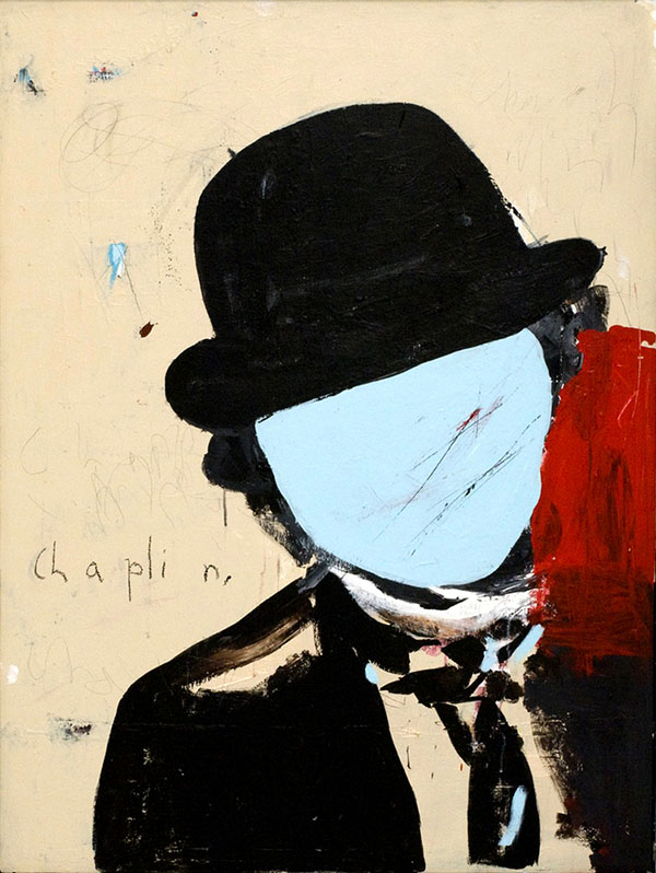
chaplin
EN: Intuition impels the artist in whatever direction a sense of “rightness” beckons, whether near or far. Immersion in the act of painting makes up a significant portion of the life of a painter, and yet such activity isn’t measured in monetary revenue, or in paint-hours; instead it has to be quantified with an instrument created for that purpose, these two halves thus offering us a glimpse of completion in their encounter with each other. In your painting chaplin, the great auteur is shown on a hagiographic scale, in the guise of his Tramp, against a flat cream field that has been painted over blue, lightly scratched and scribbled on. His face is half of a pale blue ovoid, the paint surface deeply scored to reveal a scarlet undercoat that’s matched by a bold scarlet area running from under the right side of his black derby brim and down over his left shoulder. It is as if this spirit presides over his domain in the same way that certain images in the urban landscape look down from building walls and command a vista through endless layers of paint, wheat paste, dust, and smoke. Fragments of text take on liturgical overtones in your work, invoking a private cosmology that lacks any vestige of Arabo-Greco-Judeo-Christian anthropocentrism. At the same time, the multiverse of your art posits a non-psychological self as the object of creation. The written / painted word in these pictures summons an almost incantatory power. What is the role of text in the process?
JO: Text does play a role in a lot of my work. I don’t view the text as anything different from any of the other colors, forms, or marks in my pieces. Usually the text is a result of automatism or a primitive reaction to what I see unfolding. Other times I have to go fishing for the right text. It is no different than rummaging through boxes of paint or my palette to find the right color. I’ll do this by flipping through literature and poetry. I have no ties to any context that it is used in the source I pull it from. I’m just looking for the right word or grouping of words.
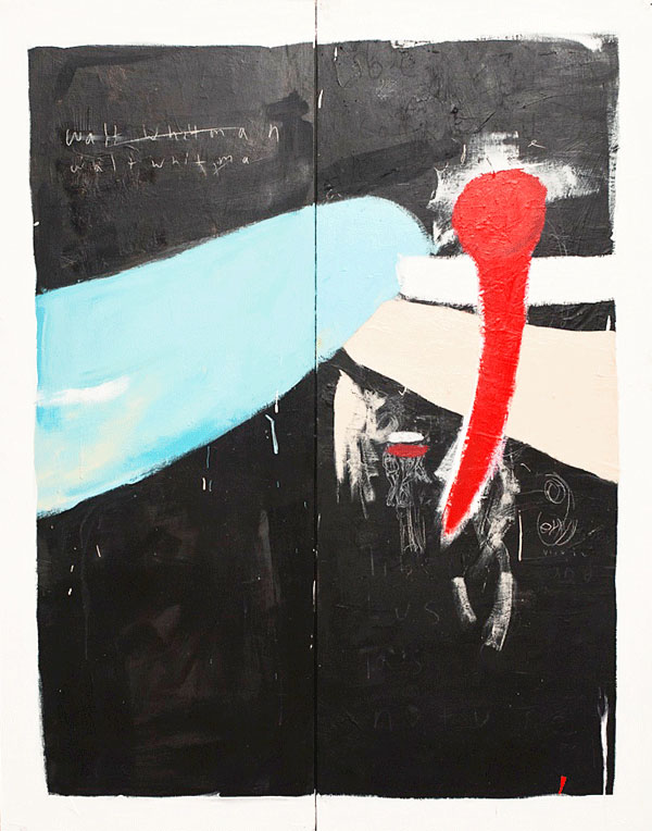
walt whitman
EN: The tendency of sortilege to liberate us from context seems to derive from the fact that by the time we allow ourselves to indulge in aleatory techniques, we have already applied various filters and demarcations to the environment, so that what seems random is anything but – being instead a gambit that goes on according to game rules: a practice common among artists across different media.
The ancient Greek Muses are the nine daughters of Mnemosyne, the goddess of memory. They preside over the arts, each of which is the domain of one of these divine siblings. Their media have been called the Sister Arts. Looking at your work, one has the impression that the light breath of poetry has animated several canvases with its kindred spirit. Your painting walt whitman is composed over an uneven black impasto applied with a palette knife over two canvases arranged side by side. A rounded pale blue form lunges across the central seam from the left; and two more forms, one white and one cream, stretch away from it and off the pictorial space on the right edge. Word fragments are faintly and sparsely drawn onto the black, and “walt whitman” is written in the upper left corner, partially crossed out, then rewritten. A small Madonna motif appears in the lower right. The composition is dominated by a large red form on the right-hand canvas, rounded at the top, curved, and pointed at the bottom, like a bodily organ in the shape of a railroad spike. How did you choose and use Walt Whitman for a picture?
JO: The Walt Whitman piece unfolded in a way that was automatic. I did not set out to make a piece with Walt Whitman’s name on it. It was more that his name spilled on the painting and I didn’t wipe it off or cover it. I felt it worked. By no means is the piece about Whitman. I think of it as rolling alongside of him. Two parallel trains traveling at different speeds to similar locations. At that time however I was reading a lot of Whitman. I had gotten in the habit of reading Leaves of Grass every morning before I began painting. So in this context he was in my well. He had polluted my water supply and when I dropped my bucket down to retrieve water his name came up and landed on the painting.
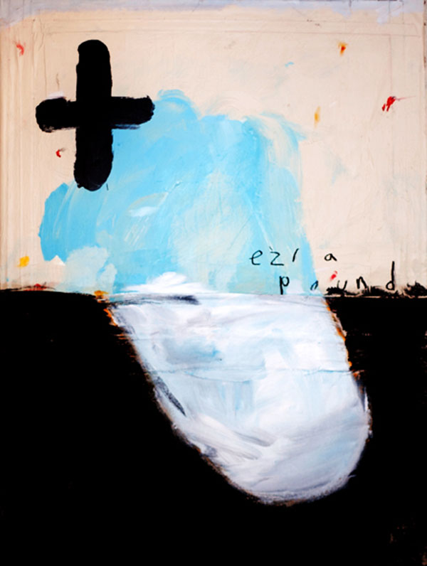
for ezra pound
EN: When ritual activity occurs in an artistic creation, it signals the presence of the sacred, and the forms of observance circumscribe the character of one’s devotion. How about the painting entitled for Ezra Pound? The canvas is taped with a kind of submerged border. An area of black, across the bottom half, and cream, thinly applied over pale blue on the top half, describe a traditional horizon line where they meet. Both zones have a large area of empty space – uneven white on the bottom and pale blue on the top – that meet in the center so that they form a single irregular rounded shape leaning to the left. A large plus-sign or cross is painted in the upper left as if daubed with a thumb, and “ezra pound” is written to the right in black above the horizon line. The name that’s painted onto this canvas conjures myriad associations: iconoclasm, the conservation of arcane traditions, a fascination with modernity, an obsession with economics, a commitment to facism, and the creation of a “poem including history,” a “grand collage.” Are these associations part of the painting, or is the poet’s name more of an autobiographical detail taken from your own life? Or is it a strictly pictorial script?
JO: The Ezra pound piece came about differently than the Whitman. I had painted the entirety of the picture with the exception of the words Ezra Pound. I was satisfied with what the piece looked like but wasn’t sure it worked. I began to scan the floor of my studio where I saw The Cantos of Ezra Pound resting. I felt it worked. The name itself has a poetic ring to it, the way it moved on the painting completed the piece. Again I can’t stress enough about the piece not being about Ezra Pound. If a painting has a speck of blue on it would one consider the work to be about the color blue? Or any other color that may be present? My works are about nothing, certainly not anything tangible. There’s nothing to “get,” there is no puzzle to solve. Turn your brain off and be in the moment. If anything they are opportunities. The ocean isn’t about swimming but it provides the opportunity to swim.
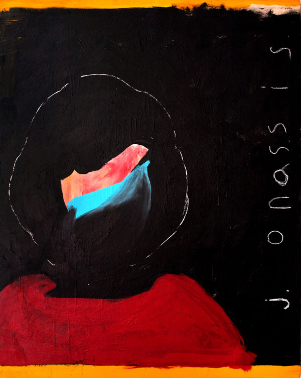
j onassis
EN: Much of your work deals with particular human beings’ position among established orders, their sociocosmic stations, so to speak. For example, one of your paintings seems to view Jacqueline Onassis as the deconstructed image of a conventional Madonna, while others present her in sharp neopop outline. The one entitled j. onassis makes it clear that the subject appears for her own sake, not as a president’s widow, nor as a girl (her maiden name is Bouvier), but alone, after she had remarried the Greek shipping magnate Aristotle Onassis, and withdrawn from public life for her family’s sake, and after she had been widowed a second time in 1975 upon his decease. In this incarnation, she is unknown and unknowable – a silhouette in white on black brushed over orange, bands of which border the piece at top and bottom. A trace of glamour persists in the elegantly scooped neckline of her red garment, and pink and blue diagonal swaths grace her visage just below the coiffure. “J. onassis” is written sideways in white along the right-hand edge of the canvas. Taken together, the images of this personage appear to dwell particularly upon fate. How did you make these pictures?
JO: For the last 4 or so years I have been making what I call “Onassis pieces.” The process in place for these works is a contradiction to the rest of my oeuvre. The first Onassis piece started and began free of cognition like the rest my work. The word Onassis spilled out. Examining the work afterwards I decided I really liked the word. It is a wonderfully poetic word. From here I began to read a lot about Jacqueline Onassis. I decided that she is a contradictory figure. Very much American but also carries an heir of European bourgousie. Fortunate and blessed, yet tragic. I liked this about her. I decided for something to exist it must have a contradiction. The color black is the contradiction of the color white. They cannot exist with out each other. So I began making Onassis portrait paintings. With these the rules are: I create this flat frontal outline of her portrait. I then use this structure to guide the dance. The dance can only take place within or outside of these lines and must contain some form of the color blue, red and yellow. This is the contradiction to my other work. In order for my other work to exist I have to create these Onassis pieces and vice-versa.
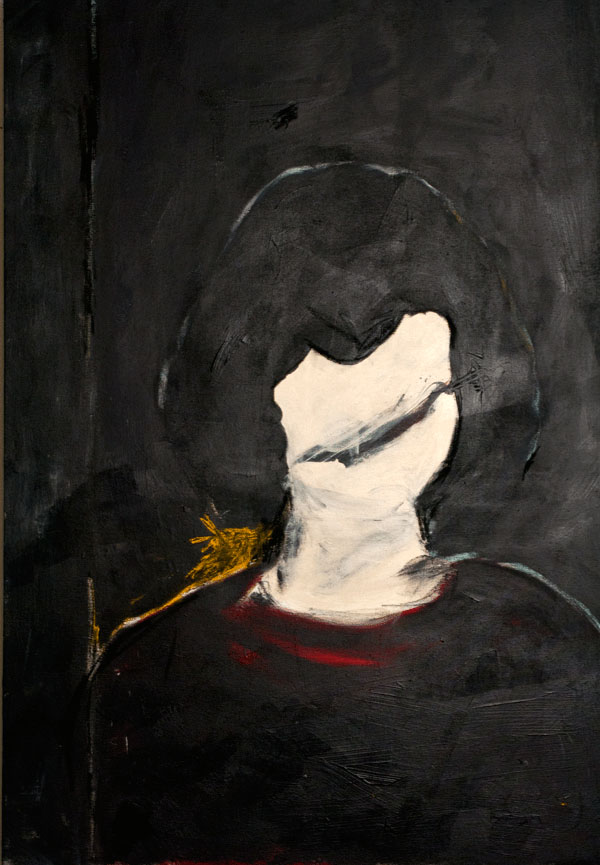
jacqueline onassis
EN: That’s an exceptionally long-term preoccupation with a single subject. Is there a more private context surrounding the Onassis paintings?
JO: This past July I had back surgery. Two lovely procedures, a microdiscectomy and a laminectomy were performed on the L-4, L-5, and S-1 portions of my lumbar spine. After surgery as you can imagine I spent a lot of time lying in bed and on the couch. My girlfriend had the foresight to supply me with a sketchbook, lots of loose paper and drawing materials. Initially I only drew Onassis portraits. I did hundreds of them. After 3 or so weeks of only doing these Onassis drawings I began to draw more abstracted pieces, and began to embrace the completely visceral and instinctual side of my process. I hadn’t noticed this. To me I was just drawing. Just passing the time. She pointed this out to me months removed from the surgery. I then realized that the repetition and rules of the Onassis drawings gave me some sort of comfort and control in wake of the chaos and vulnerability of my situation.
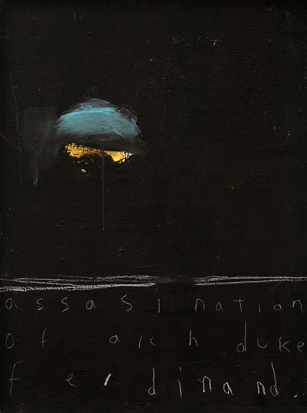
assassination of arch duke ferdinand
EN: Making art is definitely a source of solace, strength, and stability for the artist; and yet this truism often goes unremarked by commentators, apparently in favor of claims concerning a more public or outward-facing function. Even so, your work displays clear indications that for you the categories of art and history are not inimical at all; and in fact your paintings contain specific pictorial and verbal allusions to “historical” “events.” Your assassination of archduke ferdinand, a particularly baleful image, depicts a glowering figure that emerges from or recedes into the gloom of boundless depths whose only referent is abysmal outer space. A low helmet, or raised visor, executed in rapid light blue brushstrokes, lours over a pair of eyes that appear to reflect a dull gleam from someplace off the picture plane, and it’s this grim sunglasses-like gaze that conveys the sense of dimension. The cumulative effect is not that of an individual destiny, but rather of the personified spirit of cataclysmic loss which this otherwise isolated event precipitated. Except for a few irregular lateral lines drawn in white across the canvas offsetting its lower third, and the title written below, also in white, the thick black of the background is unrelieved. A single drip runs down the center of the faceless mask – neither tear nor bead of sweat nor drop of blood, but something else that somehow is all three and more. How do you arrive at a particular citation of something that really happened?
JO: In response to the historical events, they arrive on the painting in the same way the rest of my words and phrases do. They either tumble out as a visceral response or I scavenge for them. When scavenging for words or phrases I have the aforementioned response in my nervous system as soon as I see them. I then know it is the correct choice. I also know that specific words and phrases elicit certain thoughts from most people. This is fine. The works can be taken that way. They can be read very surface level in this regard. This is not my intent, but it isn’t necessarily unintended, as I have no intent. I do however hope that with the phrases/words floating with nothing to lend to their preconceived meaning that this contradiction in itself can encourage a transcendent thought. That the viewer can somehow become lost with the back and forth between the words / phrases and the other marks and this can allow the viewer to fall past the surface.
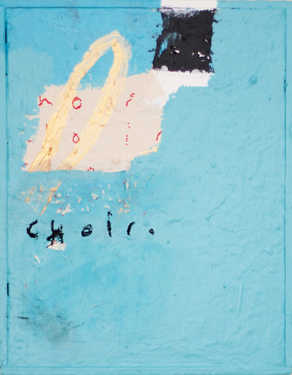
choir
EN: Awareness of effect goes hand in hand with absence of intention. With choir, for example, the viewer recalls that the painting’s title indicates both part of a cathedral and the group of people who stand there and sing. The paint surface consists of an even pale blue applied over many layers whose texture shows through. A square of black at the top to the right of center, and a rectangle of white, have not been painted over, and parts of the word “choir” are visible over the tan section. A loop or narrow ellipse of cream has been painted launching out over the tan on top of the upper mid-left, and the word “choir” is also drawn in black oil bar at the top of the lower left quadrant. When a group of people collaborates in art, each one of them is and is not the whole group. Another refreshing tendency in your work is that there doesn’t seem to be a predetermined system of “influences” at play. Meanwhile viewers may be curious to learn how you see the individual artists and artistic currents that assert a formative presence in your efforts. Color Field painting appears in the work, for instance, as does the art of Cy Twombly. How would you describe their respective effects?
JO: I admire the introspective nature color field pieces can provide. There is no denying the power of Rothko. I am also very fond of the urgency in which Twombly seemed to have painted. No time for cognition, only time for reaction.
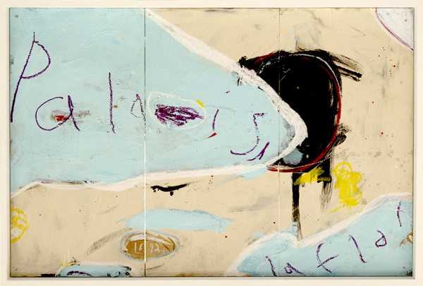
palais la flor
EN: The painter explores a relationship between tempo and texture on one hand, and spirit and physiology on the other. We, the viewers, discover elements such as pallette and calligraphy by looking along with you, the painter. The triptych palais la flor shows areas of pale blue marked off from tan by meandering white lines. The whole is painted over a coat of burgundy, and this color shows through where the title has been scratched into the top paint layer. A large black blob outlined in red centers the piece, and “1892” has been scratched into a small ovoid at the bottom, across the seam between the left and center canvases. Whom or what else would you name, if someone wanted to better understand your pictures?
JO: There is no doubt that these figures and many more from this era have impacted my understanding of art through the years. Yet, I am very aware not to repeat what they have done or base my practice around the aesthetics of any other artist. I find parallels with my thought process and practice with the writings and interviews of Agnes Martin, Twombly, and Schnabel. I strive not to be influenced at least not intentionally. There is no point in writing Tom Sawyer it has been written by Mark Twain, there is no point in doing drip paintings, they have been done by Jackson Pollock.
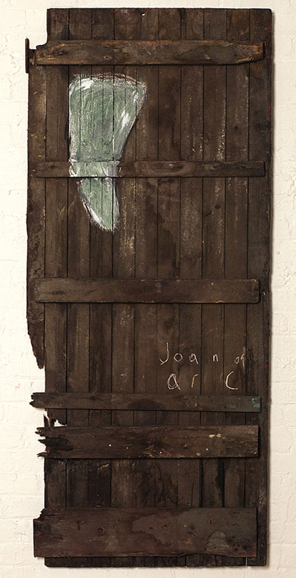
joan of arc
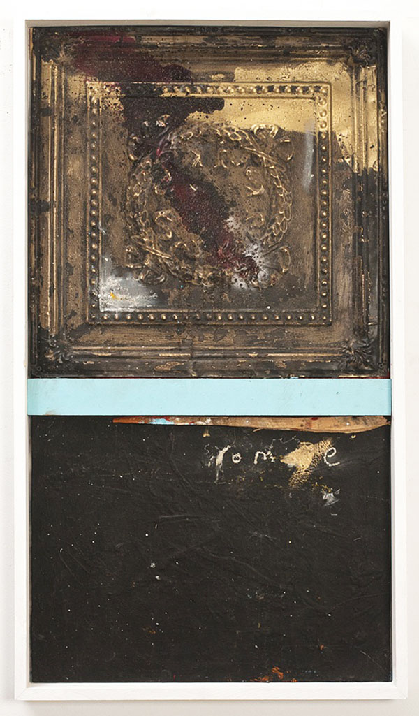
EN: Finally there are several images that incorporate found objects as painting surfaces, to significant thematic effect. Joan of arc is painted on a desiccated wooden door, the saint’s name written in white in its lower right quadrant, a quasi-anatomical heart in teal / slate green in the upper left. The diptych rome is composed of a conventional painter’s panel and a piece of architectural molding covered in tarnished gold leaf. The word “rome” appears on it, as does a quantity of your blood, also listed among the media with which the piece has been made. Clearly, entering into terra incognita requires courage. Thank you for taking the time to explain.
rome
JO: For many years I would become infuriated when asked about my work and process and say things like, “If I could explain it I would have written it and not painted it.” The past 3 years or so I have realized the importance of being able to articulate what it is I do and I appreciate this opportunity to speak on the matter.
–Erik Noonan
Interviews Painting