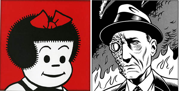
Nancy, the iconic series of graphic tone poems by the legendary Ernie Bushmiller, achieved landmark status not for its dada-esque art, its stark depiction of a near-barren (yet strangely psychedelic) landscape populated by perhaps half a dozen proto-beatniks, a tree, three rocks, maybe a house, and not just for its apparent lack of all humor—and let’s give kudos to Mr. Bushmiller here, for telling the “not-joke” decades before it became a comedy staple–but for its refusal to kowtow to bourgeois notions of “meaning.”

Left: Nancy by Ernie Bushmiller; right: William S. Burroughs by Charles Burns
But is Bushmiller’s bleak and demented, depression-era, post-apocalyptic wasteland utterly devoid of all significance? Is it truly the joyless, axiological conundrum it seems on first blush? Or is it simply that epistemology itself fails us, is unable to derive substance from Bushmiller’s nihilistic gnosticism? Here is where the cut-up method, as devised by Brion Gysin and William S. Burroughs, provides much-needed hermeneutical relief. As Burroughs himself almost said:
“The method is simple. Here is one way to do it. Take a four-panel Nancy comic. Like the ones on this page. Now cut it into four sections: 1 2 3 4 . . . one two three four. Now rearrange the sections placing section four with section one and section two with section three. And you have a new page. Sometimes it says much the same thing. Sometimes something quite different—in any case you will find that it says something and something quite definite. Perhaps you have read these Nancy strips many times. The words have lost meaning and life through years of repetition—or perhaps there was none to begin with. Now take the strip and re-arrange it. Fill a page with excerpts. Now cut the page. You have a new poem. As many poems as you like.”
Once we start mixing individual panels from multiple strips, we begin to discern connotation worming its way out of the stark ocular miasma, like a confused Ouroboros eating its own head instead of its tail. Go head, press the “Cut Up!” button below and see for yourself. If you don’t like what you see, you can drag the images to a new position, creating an immanent trope. Now do it again. And again. Some images are stark white, some yellow with age; some we see only once, some repeat again and again, in different order, like recrudescent eructations of a non-verbal virus. Be patient. Eventually, patterns emerge. Yes, Mr. Bushmiller, yes, now we “get” it.
You, sir, are gravely mistaken. Far from an “apparent lack of all humor” and “telling the not joke”, the Nancy strip was a crystaline daily joke that was clear and simple in every regard. This is what accounts for it’s vast influence and on-going fame.
WhIle you may not appreciate the subtlety of Ernie’s puns and gags, that does not make the unfunny. The world of Nancy is not a “bleak demented wasteland” – it is a colorful happy place where there is a funny joke everyday.
Compared to modern “funnies” that largely hostile, sarcastic and nihilstic, Nancy remains a giant acheivement in the art of humor.
I pity you for your apparent lack of all appreciation of humor.
This is the funniest comment we’ve ever received.
Perhaps some background information would help.
While in Venice, Ernie Bushmiller, then rising 40, wandered into the Scuola Grande di San Rocco. There, his eye seems to have been caught not by Tintoretto’s famous programme of wall and ceiling paintings but by Titian’s rather less obvious Annunciation. Perhaps he was taken by the loose brushwork. Or it may have been that he found the postcard of the Annunciation more satisfying than any of the available Tintorettos. At any rate, Bushmiller went home to Düsseldorf with the card in his pocket and, the following year, painted Annunciation after Nancy.
Of these three words, “after” (“nach”) seems the most dispensable. Obviously based on Schulz, clearly an Annunciation, Bushmiller’s work shows the angel Nancy saying “Hail, thou that art highly favoured” to an appalled Sluggo. But it is also itself a kind of announcement: here, it says, is a new dispensation in painting. It is the nach of Bushmiller’s title that really matters, because his image is, and sets out to be, a long, long way after Schulz.
What Bushmiller is really saying is that painting is dead: he makes a Nancy in 1973 to show that you can’t make Nancys in 1973. And yet that is what he has done. It isn’t Bushmiller’s first meditation on the death of painting. In the 1960s, with Sigmar Polke, he had helped invent Capitalist Realism, a kind of German take on Pop. A work such as Sluggo (1965) hinted that you could still paint properly, but not the proper subjects of High Art. It was possible to use old-fashioned words such as “perspective” and “grisaille”, but only if they were applied to, say, lavatory rolls. Now, in 1973, Bushmiller found that he was allowed to paint Annunciations after all, but that he couldn’t paint them in an Old Masterly way.
At the heart of Bushmiller’s painting are rather old-fashioned ideas of propriety that date back to Goethe. Art, especially painting, is a serious moral issue. What makes Bushmiller great is that paint isn’t merely a conceptual flag of convenience. His answers to the problems of painting are painterly ones.
Five bucks says it was Ivan Brunetti posted in defence of Nancy.
Cut up generator is on the fritz.
Fixed, thanks for letting us know!
CUT-UP button seems skiddoo’d
No images appear